Archive for the ‘experience design’ Category

Google’s Project Glass is a new model for personal computing

Friday, April 6th, 2012

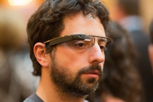
The concept video of Google’s Project Glass has whipped up an Internet frenzy since it was released earlier this week, with breathless coverage (and more than a little skepticism) about the alpha-stage prototype wearable devices. Most of the reporting has focused on the ‘AR glasses’ angle with headlines like “Google Shows Off, Teases Augmented Reality Spectacles“, but I don’t think Project Glass is about augmented reality at all. The way I see it, Glass is actually about creating a new model for personal computing.

Think about it. In the concept video, you see none of the typical AR tropes like 3D animated characters, pop-up object callouts and video-textured building facades. And tellingly, there’s not even a hint of Google’s own Goggles AR/visual search product. Instead, what we see is a heads-up, hands-free, continuous computing experience tightly integrated with the user’s physical and social context. Glass posits a new use model based on a novel hardware platform, new interaction modalities and new design patterns, and it fundamentally alters our relationship to digital information and the physical environment.

This is a much more ambitious idea than AR or visual search. I think we’re looking at Sergey’s answer to Apple’s touch-based model of personal computing. It’s audacious, provocative and it seems nearly impossible that Google could pull it off, which puts it squarely in the realm of things Google most loves to do. Unfortunately in this case I believe they have tipped their hand too soon.

Photo: Thomas Hawk / Flickr

Let’s suspend disbelief for a moment and consider some of the implications of Glass-style computing. There’s a long list of quite difficult engineering, design, cultural and business challenges that Google has to resolve. Of these, I’m particularly interested in the aspects related to experience design:

Continuous computing

The rapid adoption of smartphones is ample evidence that people want to have their digital environment with them constantly. We pull them out in almost any circumstance, we allow people and services to interrupt us frequently and we feed them with a steady stream of photos, check-ins, status updates and digital footprints. An unconsciously wearable heads-up device such as Glass takes the next step, enabling a continuous computing experience interwoven with our physical senses and situation. It’s a model that is very much in the Bush/Engelbart tradition of augmenting human capabilities, but it also has the potential to exacerbate the problematic complexity of interactions as described by polysocial reality.

A continuous computing model needs to be designed in a way that complements human sensing and cognition. Transferring focus of attention between cognitive contexts must be effortless; in the Glass video, the subject shifts his attention between physical and digital environments dozens of times in a few short vignettes. Applications must also respect the unique properties of the human visual system. Foveal interaction must co-exist and not interfere with natural vision. Our peripheral vision is highly sensitive to motion, and frequent graphical activity will be an undesirable distraction. The Glass video presents a simplistic visual model that would likely fail as a continuous interface.

Continuous heads-up computing has the potential to enable useful new capabilities such as large virtual displays, telepresent collaboration, and enhanced multi-screen interactions. It might also be the long-awaited catalyst for adoption of locative and contextual media. I see continuous computing as having enormous potential and demanding deep insight and innovation; it could easily spur a new wave of creativity and economic value.

Heads-up, hands-free interaction

The interaction models and mechanisms for heads-up, hands-free computing will be make-or-break for Glass. Speech recognition, eye tracking and head motion modalities are on display in the concept video, and their accuracy and responsiveness is idealized. The actual state of these technologies is somewhat less than ideal today, although much progress has been made in the last few years. Our non-shiny-happy world of noisy environments, sweaty brows and unreliable network performance will present significant challenges here.

Assuming the baseline I/O technologies can be made to work, Glass will need an interaction language. What are the hands-free equivalents of select, click, scroll, drag, pinch, swipe, copy/paste, show/hide and quit? How does the system differentiate between an interface command and a nod, a word, a glance meant for a friend?

Context

Physical and social context can add richness to the experience of Glass. But contextual computing is a hard problem, and again the Glass video treats context in a naïve and idealized way. We know from AR that the accuracy of device location and orientation is limited and can vary unpredictably in urban settings, and indoor location is still an unsolved problem. We also know that geographic location (i.e., latitude & longitude) does not translate to semantic location (e.g., “in Strand Books”).

On the other hand, simple contextual information such as time, velocity of travel, day/night, in/outdoors is available and has not been exploited by most apps. Google’s work in sensor fusion and recognition of text, images, sounds & objects could also be brought to bear on the continuous computing model.

Continuous capture
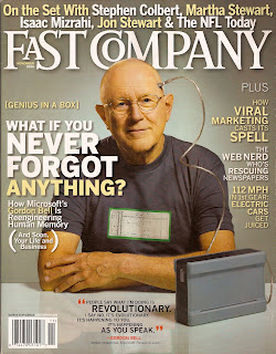
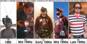
With its omnipresent camera, mic and sensors, Glass could be the first viable life recorder, enabling the “life TiVo” and total recall capabilities explored by researchers such as Steve Mann and Gordon Bell. Continuous capture will be a tremendous accelerant for participatory media services, from YouTube and Instagram-style apps to citizen journalism. It will also fuel the already heated discussions about privacy and the implications of mediated interpersonal relationships.

Of course there are many other unanswered questions here. Will Glass be an open development platform or a closed Google garden? What is the software model — are we looking at custom apps? Some kind of HTML5/JS/CSS rendering? Will there be a Glass equivalent to CocoaTouch? Is it Android under the hood? How much of the hard optical and electrical engineering work has already been done? And of course, would we accept an even more intimate relationship with a company that exists to monetize our every act and intention?

The idea of a heads-up, hands-free, continuous model of personal computing is very interesting, and done well it could be a compelling advance. But even if we allow that Google might have the sophistication and taste required, it feels like there’s a good 3-5+ years of work to be done before Glass could evolve from concept prototype into a credible new computing experience. And that’s why I think Google has tipped their hand far too soon.

in digital anima mundi

Saturday, March 17th, 2012

My SxSW session with Sally Applin, PolySocial Reality and the Enspirited World, seemed to be well received. The group that attended was well-engaged and we had a fertile Q&A discussion. Sally focused her keen anthropological lens on the study of our increasingly complex communications with her model of PolySocial Reality; for more on PoSR see Sally’s site. [Update 3/20: Sally posted her slides on PolySocial Reality]. My bit was about the proximate future of pervasive computing, as seen from a particular viewpoint. These ideas are not especially original here in 02012, but hopefully they can serve as a useful nudge toward awareness, insight and mindful action.

What follows is a somewhat pixelated re-rendering of my part of the talk.
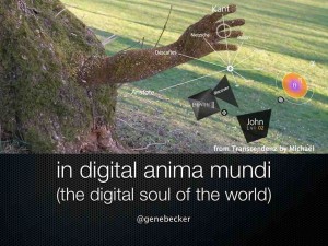
This talk is titled “in digital anima mundi (the digital soul of the world).” As far as I know Latin doesn’t have a direct translation for ‘digital’, so this might not be perfect usage. Suggestions welcomed. Anyway, “the digital soul of the world” is my attempt to put a name to the thing that is emerging, as the Net begins to seep into the very fabric of the physical world. I’m using terms like ‘soul’ and ‘enspirited’ deliberately — not because I want to invoke a sacred or supernatural connection, but rather to stand in sharp contrast to technological formulations like “the Internet of Things”, “smart cities”, “information shadows” and the like.

The image here is from Transcendenz, the brilliant thesis project of Michaël Harboun. Don’t miss it.


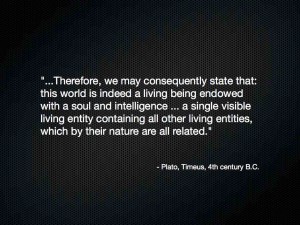
The idea of anima mundi, a world soul, has been with us for a long time. Here’s Plato in the 4th century BC.


Fast forward to 1969. This is a wonderful passage from P.K. Dick’s novel Ubik, where the protagonist Joe Chip has a spirited argument with his apartment door. So here’s a vision of a world where physical things are animated with some kind of lifelike force. Think also of the dancing brooms and talking candlesticks from Disney’s animated films.


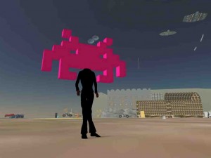
In 1982, William Gibson coined the term ‘cyberspace’ in his short story Burning Chrome, later elaborated in his novel Neuromancer. Cyberspace was a new kind of destination, a place you went to through the gateway of a console and into the network. We thought about cyberspace in terms of…


Cities of data…


Worlds of Warcraft…


A Second Life.


Around 1988, Mark Weiser and a team of researchers at Xerox PARC invented a new computing paradigm they called ubiquitous computing, or ubicomp. The idea was that computing technologies would become ubiquitous, embedded in the physical world around us. Weiser’s group conceived of and built systems of inch-scale, foot-scale and yard-scale computers; these tabs, pads and boards have come to life in today’s iPods, smartphones, tablets and flat panel displays, in form factor if not entirely in function.


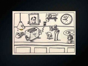
In 1992 Rich Gold, a member of the PARC research team, gave a talk titled Art in the Age of Ubicomp. This sketch from Gold’s talk describes a world of everyday objects enspirited with ubicomp. More talking candlesticks, but with a very specific technological architecture in mind.


Recently, Gibson described things this way: cyberspace has everted. It has turned inside out, and we no longer go “into the network”.


Instead, the network has gone into us. Digital data and services are embedded in the fabric of the physical world.


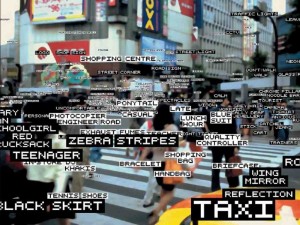
Digital is emerging as a new dimension of reality, an integral property of the physical world. Length, width, height, time, digital.


Since we only have this world, It’s worth exploring the question of whether this is the kind of world we want to live in.


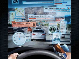
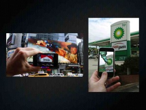
A good place to begin is with augmented reality, the idea that digital data and services are overlaid on the physical world in context, visible only when you look through the right kind of electronic window. Today that’s smartphones and tablets; at some point that might be through a heads-up display, the long-anticipated AR glasses.


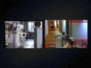
Game designers are populating AR space around us with ghosts and zombies.


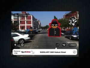
Geolocative data are being visualized in AR, like this crime database from SpotCrime.


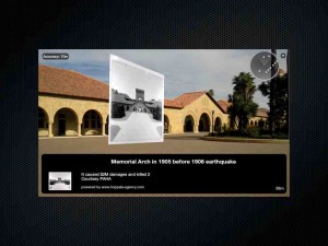
History is implicit in our world; historical photos and media can make these stories explicit and visible, like this project on the Stanford University quad.


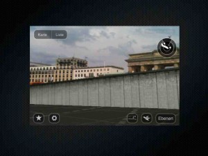
Here’s a 3D reconstruction, a simulation of the Berlin Wall as it ran through the city of Berlin.


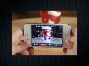
Of course AR has been applied to a lot of brand marketing campaigns in the last year or two, like this holiday cups app from Starbucks.


AR is also being adopted by artists and culture jammers, in part as a way to reclaim visual space from the already pervasive brand encroachment we are familiar with.


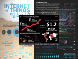
We also have the Internet of Things, the notion that in just a few years there will be 20, 30, 50 billion devices connected to the Net. Companies like Cisco and Intel see huge commercial opportunities and a wide range of new applications.


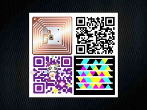
An Internet of Things needs hyperlinks, and you can think of RFID tags, QR codes and the like as physical hyperlinks. You “click” on them  in some way, and they invoke a nominally relevant digital service.


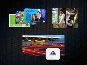
RFID and NFC have seen significant uptake in transit and transportation. In London, your Will and Kate commemorative Oyster card is your ticket to ride the Underground. In Japan, your Octopus or Suica card not only lets you ride the trains, but also purchase items from vending machines and pay for your on-street parking. In California we have FasTrak for our cars, allowing automated payment at toll booths. These systems improve efficiency of the infrastructure sevices and provide convenience to citizens. However, they are also becoming control points for access to public resources, and vast amounts of data are generated and mined based on the digital footprints we leave behind.


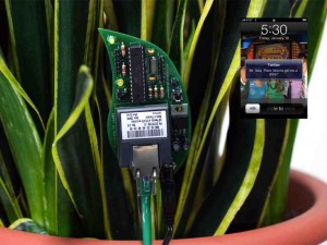
Sensors are key to the IoT. Botanicalls is a product from a few years ago, a communicating moisture sensor for your houseplants. When the soil gets dry, the Botanicall sends you a tweet to let you know your plant is thirsty.


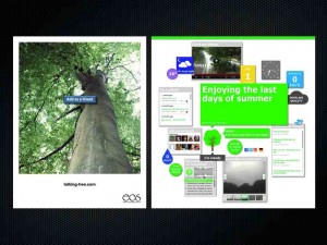
More recently, the EOS Talking Tree is an instrumented tree that has a Facebook page and a Twitter account with more than 4000 followers. That’s way more than me.


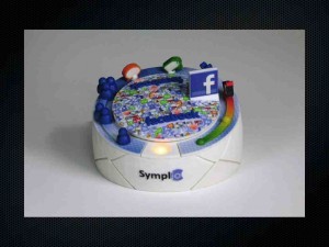
This little gadget is the Rymble, billed by its creators as an emotional Internet device. You connect it with your Facebook profile, and it responds to activity by spinning around, playing sounds and flashing lights in nominally meaningful ways. This is interesting; not only are physical things routinely connected to services, but services are sprouting physical manifestations.


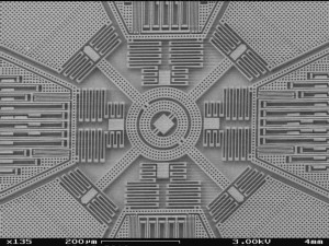
This is a MEMS sensor, about 1mm across, an accelerometer & gyroscope that measures motion. If you have a smartphone or tablet, you have these inside to track the tilt, rotation and translation of the device. These chips are showing up in a lot of places.


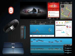
Some of you probably have a FitBit, Nike+, FuelBand, WiThings scale. Welcome to the ‘quantified self’ movement. These devices sense your physical activity, your sleep and so on, and feed the data into services and dashboards. They can be useful, fun and motivating, but know also that your physical activities are being tracked, recorded, gamified, shared and monetized.


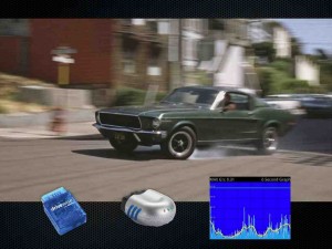
Insurance companies are now offering sensor modules you can install on your car. They will provide you with metered, pay-as-you-drive insurance, with variable pricing based on the risk of when, where and how safely you drive.


Green Goose wants you to brush your teeth. If you do a good job, you’ll get a nice badge.


How about the Internet of Babies? This is a real product, announced a couple of weeks ago at Mobile World Congress. Sensors inside the onesie detect baby’s motion and moisture content.


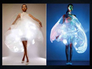
Here’s a different wearable concept from Philips Design, the Bubelle Dress that senses your mood and changes colors and light patterns in response.


So physical things, places and people are becoming gateways to services, and services are colonizing the physical world. Microsoft’s Kinect is a great example of a sensor that bridges physical and digital; the image is from a Kinect depth camera stream. This is how robots see us.


If a was a service, I think I’d choose some of these robots for my physical instantiation. You’ve probably seen these — DARPA’s Alpha Dog all-terrain robotic pack horse, DARPA’s robot hummingbird, Google’s self-driving cars. You might not think of cars as robots, but these are pretty much the same kinds of things.


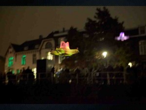
Robots also come in swarms. This is a project called Electronic Countermeasures by Liam Young. A swarm of quadrotor drones forms a dynamic pirate wireless network, bringing connectivity to spaces where the network has failed or been jammed. When the police drones come to shoot them down, they disperse and re-form elsewhere in the city.


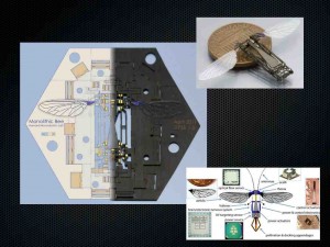
A team at Harvard is creating Robobees. This is a flat multilayer design that can be stamped out in volume. It is designed so that the robot bee pops up and folds like origami into the shape at top right. I wonder what kind of service wants to be a swarm of robotic bees?


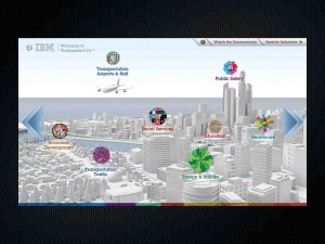
On a larger scale, IBM wants to build you a smarter city. There are large smart city projects around the globe, being built by companies like IBM, Cisco and Siemens. They view the city as a collection of networks and systems – energy, utilities, transportation etc – to be measured, monitored, managed and optimized. Operational efficiency for the city, and convenience for citizens.


But we as individuals don’t experience the city as a stack of infrastructures to be managed. Here’s Italo Calvino in his lovely book Invisible Cities. “Cities, like dreams, are made of desires and fears…the thread of their discourse is secret, their rules absurd.”


Back at ground level in the not-so-smart city of today, displays are proliferating. Everywhere you turn, public screens are beaming messages from storefronts, billboards and elevators.


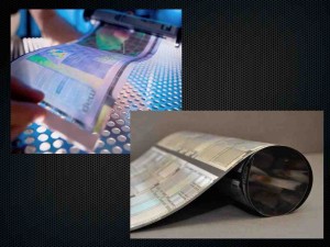
We’re getting close to the point where inexpensive, flexible plastic electronics and displays will be available. When that happens, every surface will be a potential site for displays.


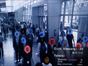
We’re also seeing cameras becoming pervasive in public places. When you see a surveillance camera, do you think it’s being monitored by a security guard sitting in front of a bank of monitors as seen in so many movies? More likely, what’s behind the camera is a sophisticated computer vision system like this one from Quividi, that is constantly analyzing the scene to determine things like the gender, age and attention of people passing by.


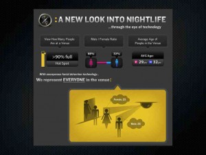
A similar system from Intel called Cognovision is being used in a service called SceneTap, which monitors the activity in local nightclubs  to let you know where the hottest spots are at any given moment.


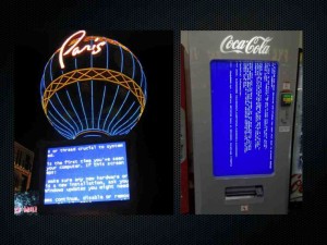
You’ve probably seen something like this. It’s worth remembering that our technologies are all too brittle, and you should expect to see more of this kind of less-than-graceful degradation.


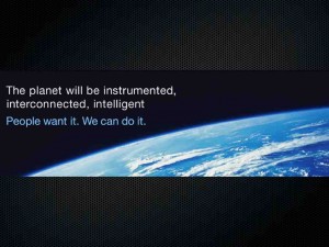
In case the city isn’t big enough, IBM wants to bring us a smarter planet. HP wants to deploy a trillion sensors to create a central nervous system for the earth. “The planet will be instrumented, interconnected and intelligent. People want it.” But do we? Maybe yes, maybe no?


So we come back to the question, what kind of world do you want to live in? Almost everything I’ve talked about is happening today. The world is becoming digitally transformed through technology.


Many of these technologies hold great promise and will add tremendous value to our lives. But digital technology is not neutral — it has inherent affordances and biases that influence what gets built. These technologies are extremely good at concrete, objective tasks: calculating, connecting, distributing and storing, measuring and analyzing, transactions and notifications, control and optimization. So these are often fundamental characteristics of the systems that we see deployed; they reflect the materials from which they are made.


We are bringing the Internet into the physical world. Will the Internet of people, places and things be open like the Net, a commons for the good of all? Or will it be more like a collection of app stores? Will there be the physical equivalents of spam, cookies, click-wrap licensing and contextual advertising? Will Apple, Google, Facebook and Amazon own your pocket, your wallet and your identity?


And what about the abstract, subjective qualities that we value in our lives? Technology does not do empathy well. What about reflection, emotion, trust and nuance? What about beauty, grace and soul? In digital anima mundi?


In conclusion, I’d like to share two quotes. First, something Bruce Sterling said at an AR conference two years ago. You are the world’s first pure play experience designers. We are remaking our world, and this a very different sort of design than we are used to.


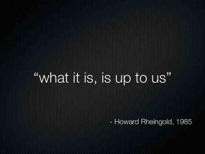
What it is, is up to us. Howard first said it more than 25 years ago, and it has never been more true than today.


I want to acknowledge these sources for many of the images herein.


Regarding “Strong AR” and “Weak AR”

Wednesday, May 25th, 2011

[Crossposted from the Layar blog.]

At the end of his otherwise lovely keynote at ARE2011, Microsoft’s Blaise Aguera y Arcas proposes a distinction between “strong AR” and “weak AR”. Aguera’s obviously a very talented technologist, but in my opinion he’s done the AR industry a disservice by framing his argument in a narrow, divisive way:

“I’ll leave you with just one or two more thoughts. One is that, consider, there’s been a lot of so called augmented reality on mobile devices over the…past couple of years, but most of it really sucks. And most of it is what I would call weak augmented reality, meaning it’s based on the compass and the GPS and some vague sense of how stuff out there in the world might relate to your device, based on those rather crude sensors. Strong AR is when you, when some little gremlin is actually looking through the viewfinder at what you’re seeing, and it’s saying ah yeah that’s, this is that, that’s that and that’s the other and everything is stable and visual, that’s strong AR. Of course the technical requirements are so much greater than just using the compass and the GPS, but the potential is so much greater as well.”

Aguera’s choice of words invokes the old cognitive / computer science argument about “strong AI” and “weak AI” which was first posed by John Searle in the early heyday of 1980’s artificial intelligence research [Searle 1980: Minds, Brains and Programs (pdf)]. However, Searle’s formulation was a philosophical statement intended to tease out the distinction between an artificially intelligent system simulating a mind, or actually having a mind. Searle’s interest had nothing to do with how impressive the algorithms were, or how much computational power was required to produce AI. Instead, he was focused on the question of whether a computational system could ever achieve consciousness and true understanding, and Searle believed the concept of strong AI was fundamentally misguided.

In contrast, Aguera’s framing is fueled by technical machismo. He uses strong and weak in the common schoolyard sense, and calls out “so-called augmented reality” that is “vague”, “crude”, and “sucks” in comparison to AR that is based on (gremlins, presumably shorthand for) sophisticated machine vision algorithms backed with terabytes of image data and banks of servers in the cloud. “Strong AR is on the way”, he says, with the unspoken promise that it will save the day from the weak AR we’ve had to endure until now.

OK, I get it. Smart technology people are competitive, they have egos, and they like to toss out some red meat now and then to keep the corporate execs salivating and the funding rolling in. Been there, done that, understand completely. And honestly, I love to see good technical work happen, as it obviously is happening in Blaise’s group (check out minute 17:20 in the video to hear the entire ARE crowd gasp at his demo).

But here’s where I think this kind of thinking goes off the rails. The most impressive technical solution does not equate to the best user experience; locative precision does not equal emotional resonance; smoothly blended desktop flythroughs are not the same as a compelling human experience. I don’t care if your system has centimeter-level camera pose estimation or a 20 meter uncertainty zone; if you’re doing AR from a technology-centered agenda instead of a human-centered motivation, you’re doing it wrong.

Bruce Sterling said it well at ARE2010: “You are the world’s first pure play experience designers.” We are creating experiences for people in the real world, in their real lives, in a time when reality itself is sprouting a new, digital dimension, and we really should try to get it right. That’s a huge opportunity and a humbling responsibility, and personally I’d love to see the creative energies of every person in our industry focused on enabling great human experiences, rather than posturing about who has stronger algorithms and more significant digits. And if you really want to have an argument, let’s make it about “human AR” vs. “machine AR”. I think Searle might like that.

the critical challenge for augmented reality in 2011

Monday, January 3rd, 2011

If there’s one thing we in the augmented reality community need to do this year, it is to make actually using AR a better experience than looking at screenshots and videos of it.

If you ask most AR experts what the biggest challenge is for mobile AR, you’ll likely hear about technology issues. “Mobile AR won’t be taken seriously until it can do X” where X is something like centimeter-accurate location and camera pose determination, continuous image recognition, 3D object tracking, or perhaps making a band of angels dance on the surface of a contact lens.

I love that stuff too. Advancing the technology is great, and it does make for cool screenshots and demo reels. But I guess I have a different view of what’s most important.

AR is a unique medium because it blends digital content with the physical world. It happens in the places where we experience our lives; in cities, villages, countryside and wilderness, with family and friends and strangers around. It happens in the now, day and night, spring and fall. It engages our senses and taps into our emotions, revealing the invisible stories of the world around us. AR is a medium of living human experience.

In AR, we already have an incredible toolbox of capabilities to work with. Mobile is mainstream, we’re all connected, and data is gushing from every spigot. It’s truly an embarassment of riches.

What the AR community needs most this year is to push the frontiers of creative expression; to engage all of our senses, to embrace narrative and culture and play, to use the world as both a platform and a stage. In 2011, we need to become the best possible storytellers and experience designers for this new physical, digital, experiential medium.

If we can’t do this, none of our technology will matter, except maybe on YouTube.

why a twitter overlay on your internet tv is a bad idea

Thursday, May 27th, 2010

twitter-idol-spoiler

Experience Design for Mobile AR: my Web2Expo slides

Wednesday, May 5th, 2010

my talk on mobile AR experience design at Web2Expo

Tuesday, April 27th, 2010

I’m presenting a session at Web2Expo in San Francisco on May 4th, titled “Challenge, Drama & Social Engagement: Designing Mobile Augmented Reality Experiences“. Here’s the blurb:

Mobile augmented reality adds digital overlays and interactivity to the physical world using the sensors and display of your smartphone. Design of mobile AR experiences is complex and takes us well beyond the browser-based web. This session will give you a mix of practical knowledge and new ideas for creating AR experiences, drawing from web design, 3D graphics, games, architecture and stagecraft.

The next generation of mobile augmented reality applications will go well beyond simply overlaying points of interest, floating post-its and 3D models on the video display of your phone. Mobile AR is becoming a sophisticated medium for immersive games, situated storytelling, large-scale visualization, and artistic expression. The combination of physical presence, visual and audio media, sensor datastreams and social environments blended together with web services offers tremendous new creative possibilities. However, the design challenges of creating engaging, exciting and compelling experiences are quite significant.

Research on the design of technology-mediated experiences has shown that compelling experiences often involve a mixture of physical and mental challenge or self-expression, a sense of drama, sensory stimulation, and social interaction. These elements can give us a physical “buzz” by activating the release of adrenaline, endorphins and related neurochemicals.

Mobile AR puts us “where the action is”—in motion through the physical world, surrounded by other people, in a stimulating environment. AR applications additionally provide challenges, stories, information and communication. Factors that AR experience designers need to consider include:

  • Goals of the AR experience
  • Users’ cognitive model of the system
  • Physical environment and context of the experience
  • Social context of the experience
  • Design of interaction models and experience mechanics
  • Story, goals and outcomes
  • Immersion and flow
  • Design of visual and audio assets
  • Non-player characters (“AIs”)
  • Tracking and analytics
  • Technical capabilities and limitations of the AR system
  • Managing the production process (designing an AR experience has much in common with producing a movie on location)

Should be fun, ping me if you’re going to be at the conference!

the massively multiplayer magazine

Friday, February 19th, 2010

This idea is a quick brainstorming sketch that brings together several threads in the spirit of combinatorial innovation. I’d love to have your feedback in the comments.

The future of magazines in a connected world

I love magazines, and I’ll bet you do too. Magazines are perhaps the most vibrant and culturally relevant form of print media, and their diversity mirrors the staggering range of human interests and obsessions. In the connected world, they have the potential to evolve into an incredibly interesting and engaging networked medium. In recent months we have seen two inspiring future design concepts: the lushTime/Sports Illustrated video, and the poeticMag+ conceptcreated by design firm@BERGLondonand publisherBonnier. With high performance, connected e-reader and tablet platforms finally coming to market, it’s clear we are going to see some very exciting developments in this space. However, we should remember that the fundamental nature of connected media is very different from that of print media, and we should be careful about bringing a print-oriented mindset to a new networked medium. The features of electronic magazines should not simply be incremental extensions of the printed version, even if the physical artifacts are roughly similar in size, shape and appearance. With that in mind, I’d like to engage you in a thought experiment about what could happen when we collide digital magazines together with the global social Internet. One possibility we might imagine ismassively multiplayer magazines.


Massively multiplayer what?

You’re probably familiar with massively multiplayer online games like World of Warcraft. The massively multiplayer magazine re-imagines the traditional periodical in the context of an online social game environment involving thousands of people. In this scenario, the magazine becomes a gateway into a universe of intertwined stories, knowledge, people and play, with experience design and game mechanics drawn from MMOGs, ARGs and social games. Readers become players who have profiles, scores, achievements and abilities. Players self-assemble into clans, guilds and communities. Game elements encompass traditional magazine fare such as stories, images, features and advertisements, alongside new aspects including collaborative quests, mini-games, social streams, location awareness, augmented reality and physical hyperlinks. Gameplay involves completing missions, defeating bosses, unlocking hidden features, and participating in experiences that add richness, engagement and dimensionality to the magazine’s thematic center.

Magazines are like printed Usenet

Magazines are like printed Usenet

Magazines are like printed Usenet

You may be thinking this is a pretty strange idea, because magazines and online games seem like completely different media with little apparent synergy.  But consider: A well-stocked newsstand’s magazine rack is a glossy reflection of a world of enthusiast niches, each one incredibly narrow and deep. From heavy metal music to needlepoint; from luxury island living to body modification culture, magazines are the proto-Usenet of publishing. Furthermore, every special interest grouping you can imagine has already established itself in some form of online presence, be it a mailing list, web forum, or social network. The inherently social, topical milieu of magazines and their enthusiast communities has much in common with the ecosystem of social, story-oriented worlds and deeply invested players of many online games. It’s not hard to imagine that online gamers and magazine readers would each be attracted to a medium that combined the best of both genres. In fact, there is ample precedent for communities passionately following and participating in stories and games across multiple media. Think of Pokemon, Survivor, and the Star Wars Universe as examples of huge cultural phenomena with stories that span books, television, games, the web and more. For more on that, you might enjoy going down the deep rabbit hole of transmedia storytelling. But let’s continue.

Possible user stories

Clearly, this new kind of magazine/game would be primarily a digital medium. Mobile tablet computers like the just-announced Apple iPad would be excellent platforms to build optimized experiences around. Moreover, a massively multiplayer magazine would also play out across websites, social forums and physical locations, in much the same way that many alternate reality games have done. With the addition of ‘clickable’ links via QR codes and similar physical links, even readers of printed magazines could be drawn into the game through their mobile phones.

So what would a massively multiplayer magazine be like? Here are a few possible user stories that begin to explore the concept; you should definitely add your own ideas in the comments:

* Each story is a context that you “check into”, much like a Foursquare location. This might show up in your Twitter stream as “I’m reading <article> with 5 other people http://j.mp/xG08U“, with a shortened link directly to the article. As you check in and comment about the article in your social stream, you accumulate points in your profile for each new reader that clicks through your link. If you are leafing through a paper copy of the magazine, you might find a QR code printed on the page, and scan it with your smartphone to “check in” and connect to the social stream about the article.

* Stories are customized based on your location. When you are physically in Paris, stories and games with a Parisian context are revealed. Reading those stories in their intended locations around the city earns you a special achievement badge for Paris. Meeting local players face to face grows your social circle and adds to your in-game reputation.

* A rock music magazine works with bands and concert promoters to place printed QR codes on posters at live shows, and readers earn badges by going to the show and scanning the codes.

* A pop culture fan magazine creates a series of 12 monthly challenges, each building on the previous one and taking players progressively deeper into a complex storyline. The challenges can only be worked out through large-scale cooperation by fans; the resolution leads to a hidden plot device in the upcoming season of a hit reality TV series.

* An advertiser sponsors a global treasure hunt, with rabbit holes, missions and puzzles embedded in the digital and print versions of a travel magazine. The prize is significant and the story engaging enough to attract tens of thousands of players and drive millions of social media mentions and impressions over the entire duration. For inspiration, take a look at the ARG calledPerplex City, which offered a $200,000 prize for finding a game artifact called the Receda Cube.

* Collaboratively generated story/soundtrack pairings are recommended by your friends and other readers of the same stories. “One of your friends recommended the Cowboy Junkies channel on Pandora, to accompany this story on musician Townes Van Zandt.” Alternatively, writers and photographers offer their own musical pairings to convey mood and contextual cues for their work, similar to sound design for cinema.

* A media literacy foundation challenges teams to create an entirely new magazine, organized around crowdsourced recommendations and contributions for the best stories, photographs, video, audio and even advertisements. The contributors earn achievements and reputation scores based on readers’ ratings and social metrics. The winning team receives a grant funding the creation of their next 6 issues, and featured placement on a popular media blog.

These are only a few examples of the possibilities of a new kind of massively multiplayer media. There are many open questions here, obviously. Would publishers find this concept attractive? Would readers make the leap to become players in a worldwide game? How hard would they be to develop [see note 2 below], and at what cost? It’s no sure thing, but I am inclined to believe that the well-established cultural familiarity and affection for magazines, combined with the addictive and viral nature of online games like Farmville and Foursquare, and built on the mobile, social, contextual platform of the connected world, would make an incredible creative genre and a very interesting business opportunity.

What do you think? Leave comments, send me email, or tweet some feedback to @genebecker. Thanks for reading, and YMMV as always.


[1] Photo credit: mannobhai

[2] It’s worth noting that designing media to be massively multiplayer will require new skills, tools and workflows, well beyond those employed in today’s magazine publishing ecosystem; our hypothetical project will surely need to address the authoring process. If you are interested, Ben Hammersley makes this point well in a series of eloquent posts that are worth your time.

let’s bury the electronic newspaper

Friday, January 22nd, 2010

In technology, use model and interface metaphors exert a powerful influence on the rhetorical framing innovators adopt for their work. These metaphors can become entrenched schools of thought in product and experience design, making it difficult to imagine alternative approaches. Consider the longevity of the desktop metaphor for personal computing – it has been more than 35 years since the original Xerox PARC Alto, and we are still looking at desktops on many of our screens.

Similarly, the idea of electronic newspapers has been around since at least the 1970s, and now that the print newspaper industry is in dire straits we are seeing that notion thrown around rather more freqently. For example, LG Display is currently showing off an impressive lab prototype of a 19” flexible e-paper display that is 0.3mm thick and weighs just 4 ounces. The prototype measures 40x25cm or around 16×10 inches, making it about the size of a small tabloid newspaper. LG are touting it as “optimized for an e-newspaper and able to convey the feeling of reading an actual newspaper”

lg-19-inch-epaper

LG Display 19" e-paper prototype

As I see it, there’s a fundamental problem with attempts to transplant the design of physical newspapers into an “electronic newspaper” interaction metaphor. The design of print newspapers, and our interaction with them – where, when, what and how we read – arises from the intrinsic properties of the medium. The size of pages, the multicolumn tiled layout, the length of stories, the variety and separation of sections, advertising, subscriptions, deadlines, distribution, local geographic focus, national syndication, editorial viewpoint – all of these factors evolved to their current state largely due to the physical properties and economics of paper. When you remove the paper and substitute a dynamic networked display appliance, you have changed the underlying properties and constraints so radically that the entire newspaper metaphor collapses.

Furthermore, as Clay Shirky and many others have observed, the Internet has spawned a host of disaggregated alternatives to all of the major functions of print newspapers. From online news sites, blogs and social media to Craigslist, Google, spot.us and the Sunlight Foundation, we are evolving new structures, business logic and user experiences based on the properties and economics of connected world technologies. As Shirky wrote in March 2009:

Round and round this goes, with the people committed to saving newspapers demanding to know “If the old model is broken, what will work in its place?” To which the answer is: Nothing. Nothing will work. There is no general model for newspapers to replace the one the internet just broke.

With the old economics destroyed, organizational forms perfected for industrial production have to be replaced with structures optimized for digital data. It makes increasingly less sense even to talk about a publishing industry, because the core problem publishing solves — the incredible difficulty, complexity, and expense of making something available to the public — has stopped being a problem.

When I see electronic versions of print newspapers being sold for Amazon’s Kindle, demonstrated on the Plastic Logic QUE, and mocked up in demos like LG’s flexible plastic e-paper, I see designers and marketers indulging in nostalgia for a bygone era. Newspapers as we know them are pretty much dead. Let’s bury the electronic newspaper metaphor with them.

Postscript:

hakon-lie-monitor

While researching this post I came across Hakon Lie’s 1990 MSc thesis from the MIT Media Lab, titled The Electronic Broadsheet – all the news that fits the display. Lie describes the design and implementation of a broadsheet-sized electronic newspaper on a large high resolution display. Although some of the leading edge technology from 1990 (pre-WWW, pre-flat panel monitors) seems quaint now, Lie’s overview of the Newspaper Metaphor remains relevant and worth reviewing. Lie sought to maintain the best qualities and practices of newspaper reading while augmenting them with the affordances of networked digital media, reifying the whole into a new kind of newspaper. At the time, he did not anticipate the breadth and depth of disruption that would begin in just a few years with the advent of the web. Of course Lie went on to develop CSS in 1994, demonstrating somewhat greater adaptability than the newspaper industry he sought to transform.