This is augmented reality

experience design for locative media & AR

Thursday, December 3rd, 2009

The next generation of mobile Augmented Reality applications will go well beyond simply overlaying points of interest, floating post-its and 3D models on the video display of your phone. Mobile AR is becoming a sophisticated medium for immersive games, situated storytelling, large-scale visualization, and artistic expression. The combination of physical presence, visual and audio media, sensor datastreams and social environments blended together with web services offers tremendous new creative possibilities. However, the design challenges of creating engaging, exciting and compelling experiences are quite significant. AR experience designers will draw fruitful inspiration and practical lessons from game design, 3D graphics, architecture and stagecraft, as well as the structure, linking, protocols and openness of the web.

Some of the best research to date on experience design for locative media experiences, was done at HP Labs as part of the Mobile Bristol collaboration. You might find these papers useful and applicable to AR design, as I have.

Technology Experiences: What Makes Them Compelling? Alison Kidd, 2000

Experience Design for Pervasive Computing, Richard Hull & Jo Reid

Experience Design Guidelines for Creating Situated Mediascapes, Reid et al, 2005

Magic Moments in Situated Mediascapes, Reid et al

we’re wired to augment our world and our selves

Tuesday, December 1st, 2009

Humans are driven to augment our reality, and to augment our own capabilities. It’s the way we’re wired; it’s what we do. From the earliest cave paintings to modern day urban graffiti, we overlay our world with expressions of our inner selves. Architecture, street signs, billboards, fashions — these are all visual and functional augmentations of the physical world. We extend our sensory and cognitive capabilities as well, creating tools that allow us to perceive phenomena beyond the ken of our normal senses — at extremes of scale, distance, time, frequency, complexity, sociality. “Augmented Reality” is simply the next technological framework for expressing the natural human propensity to augment our world and our selves.

fiyo on the bayou: junaio from metaio

Friday, October 30th, 2009

In the last week I’ve been beta testing junaio, Metaio’s new mobile augmented reality app for the iphone 3gs. junaio allows you to author mixed reality scenes by adding 3D models to physical world locations, experience AR scenes on location in live video overlay mode, and share your scenes with other people on junaio and Facebook. My thoughts here are based on a pre-release version that does not include broader functionality such as online scene editing through the junaio.com website.

My overall impression is that junaio is a fun, interesting app that is very different from other mobile GPS+compass AR apps. Popular mobile AR apps like Layar, Wikitude, Robotvision, GeoVector and so on are mostly information centric, focused on finding and presenting geoweb and POI data about the world. In contrast, junaio is about personal augmentation of the world with visual models — it’s essentially a storytelling environment where users can express themselves through 3D world-building and share their creations with a social community.

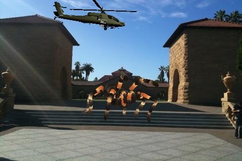
A slight disturbance on the stanford quad

A slight disturbance on the stanford quad

I found the creative authoring process surprisingly absorbing and satisfying, much more so than experiencing the scenes through the live “magic lens” for example. I was also impressed at how much could be done with a few finger gestures on a tiny device out in the world. Here’s an example scene I created while driving up Alpine Road last night (definitely not a recommended authoring process!):

kids, don't try this at home

kids, don't try this at home

Although junaio is a unique and engaging application with great ambition, I will warn you that it suffers somewhat from its high aspirations. junaio proposes to make 3D environment authors of us all. It does a reasonable job of simplifying a complex process and making it possible on a mobile device, but as a result it takes shortcuts that reduce the effectiveness of the end experience. For example the live camera overlay mode was a disappointment, because you do not experience the 3D scene that the author intended. I understand the technical reasons for this — limited GPS accuracy, lack of true 3D placement of objects, lack of camera pose data, physical world changes, etc — but my expectations were implicitly set that my scenes would turn out exactly the way I created them. Also, the user interaction model for the app is still rough in places, and I think many people will find it confusing and difficult to learn.

Despite the significant limitations of this first release, I actually think I will continue to use junaio. I really enjoy its creative aspects, and I think there is a lot of potential in the social community interaction as well. It’s not going to be everyone’s cup of tea, but I see it as a lovely way to live a few extra seconds into the future. Looking forward to the final release in the next few days.

In case you’re wondering, “Fiyo on the Bayou” is a song by the great Neville Brothers. Got a bit of New Orleans on the brain today, or maybe I’m hoping for a nice model of animated flames that I can place out on the Bay. Okay, mostly I just like the way it rhymes with “junaio from metaio”. YMMV as always. Cheers all.

you know it’s the future when there’s a futurist floating in your magic window

Monday, September 21st, 2009

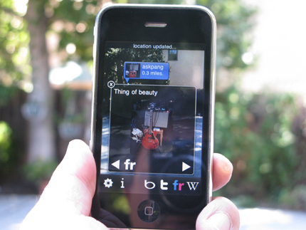
askpang-augmented-400px

That’s @askpang‘s photo, apparently. How perfectly appropriate, on so many levels. Well Alex, it looks like the end has arrived.

Bonus points for naming that app.

Update 9/24/09: OK yes it’s @u2elan‘s Robotvision, which dropped in the app store today. But it’s version 1.1, with secret Wikipedia goodness, w00tski!

hardly strictly augmented reality: GeoVector World Surfer

Saturday, September 19th, 2009

I think it’s pretty interesting that GeoVector’s new World Surfer app (that just dropped for iPhone and shortly for Android) doesn’t have any augmented reality eye candy. After all, GeoVector seems to have invented the idea of mobile GPS+compass AR over 10 years ago, and has had a commercial mobile service running in Japan on KDDI since 2006. But this app doesn’t sport any of the floaters, auggies, phycons or general aurora digitalis of graphics overlaid on the camera’s video view, that we have rapidly come to associate with augmented reality in 2009. I posed the question to GeoVector, and here’s what CEO John Ellenby had to say about it:

“GeoVector’s mission is to link people using a large range of handsets with data about places in the world in the simplest, most efficient manner that can be widely deployed.  From our fielded work in Japan it is clear that pointing the phone to filter by direction is the simplest, most straightforward, pedestrian-friendly method of local search with broad appeal.   Our upcoming products for US and Europe leverage that experience from Japan, include support for information displayed in camera view and are designed for users who are in an environment which allows them to safely experience virtual enhancement to the images they are seeing.  We believe AR mode is an exciting complementary feature to many applications from history tours to real world immersive gaming and introduces strong additional visualization.”

From where I sit, that basically means “You’re going to like pointing, but stay tuned to this channel, eyepaper fans.” Sweet, the first product is just hitting the streets and already with the teasing.

A divining rod for information

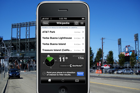
So I’ve been testing a pre-release iPhone version of World Surfer. The basic premise of the application is more or less the same as all the other recent entrants in this space: mobile smartphone with GPS and digital magnetometer (compass) knows where you are, knows what direction you are facing, connects to a web service and shows you points of interest (POIs) from a database of georeferenced entities.

Where it differs is its focus. World Surfer is designed for finding what you are looking for, and then getting you there. It’s not an AR magic lens, but it is a tricorder, or perhaps a divining rod for hidden information. You point in the direction you are headed, you browse one of the local channels like Bing, Yahoo, and Wikipedia, scope out the restaurant or attraction you want to go to, and World Surfer shows you the way. Literally, a big red arrow shows you which direction to walk. You can also get traditional driving directions on a Google map view, click to call, check reviews, and see related search results from Flickr, Google and YouTube.  It is easy to switch between the directional pointing mode and 360-degree search, depending on what you need at the time. In operation, the app’s performance was smooth and responsive, and the touch-based user interface was easy to learn and navigate after a few minutes of poking around the various controls.

GeoVectorWorldSurfer_iPhone_02

Channeling the city

World Surfer has a lot in common with the Yelp iPhone app, so I tested them side by side. World Surfer is definitely much more of a native geo-app with its pointing and wayshowing model. Although it doesn’t have Yelp’s huge user community and name recognition, World Surfer has broader applicability because it supports an arbitrarily wide range of channels. Yelp does have that Monocle AR eye candy thing, which looks cool but unfortunately is pretty much useless. In the end, my conclusion was that Yelp should actually just be a channel on World Surfer.

Speaking of channels, I was pleasantly surprised to find that World Surfer’s channels are dynamic. That is, the channels available to you are contextual to your location, and when a new one becomes available it just shows up in the app. After the first new channel magically showed up, I found myself opening up the app several times a day just to see if there was anything new to point at.

Other features I liked about World Surfer include bookmarking — you can bookmark your current location, which is good for remembering where you parked your car,  and the toilet channel (!) provided by sitorsquat.com, which shows public restrooms with user ratings. That last one sounds a bit weird, but is unbelievably handy for a day of wandering around the city consuming refreshing beverages of your choice.

Rough surf

There are some things I’m not wild about in World Surfer. These include:
* Having Bing, Yahoo and Google channels feels redundant. Each has a different browsing hierarchy, which is confusing. And each has a different but incomplete dataset of POIs. Of the three, Bing seemed the most comprehensive (probably due to their Citysearch database) and Google the least so (Google limits local search results to 32 items per query).
* No search box. World Surfer would be substantially improved if you could search across all of the current channels with a single query. Sometimes browsing a directory tree just isn’t what you want, right? I thought we learned that on the Internet awhile back.
* Branded channels. My test app had channels for a coffee company and a pizza chain. I understand the rationale and the business imperative for having branded channels, but I also can see how the user experience is likely to be degraded when a large number of brands get on the bandwagon. Imagine scrolling through a list of channels for every major national brand that has stores near your location. There’s a significant set of UI & UX issues that need to be addressed for small-screen mobile AR in a large-dataset world.
* No ability to add content. Although you can read reviews of many establishments, the current channels don’t provide any way for you to add ratings and leave comments the way you can on Yelp, for instance. Also, there is no mechanism for end users to create their own POIs on any of the channels.
* No elevation pointing. In Japan, you can point your phone up and down and get different results, for example on different floors of a tall building. According to GeoVector, this is a limitation of the US phones’ magnetometer system. Too bad, I’d like to see elevation become part of the standard spec for modern geo-annotations and POIs.
* Inaccurate for close-in POIs. Like other GPS+compass apps, WorldSurfer doesn’t handle POIs well if their position is within the error range of the device. However you can deal with this by manually switching to 360 mode.
* POI data quality. GeoVector gets their POI data from third parties, and the datasets are often incomplete or inaccurate. Like other players in this space, GeoVector needs to step up and take ownership for their users’ experience, and start driving industry standards for data quality.

Just do it

Overall, my conclusion is World Surfer is quite a nice useful app, especially for people who like exploring cities on foot. It looks good, works well, and doesn’t make you feel self-conscious when you use it. There is definitely room for improvement, but none of the issues are showstoppers for a version 1.0 release. However GeoVector really needs to ramp up its developer activities, because it is the content and presentation of the specific channels that will make or break the usefulness, applicability and user experience that gets delivered.

World Surfer is priced at $2.99 and it’s worth it, but you’ll want the new iPhone 3GS or a suitable Android phone to take full advantage of its pointing features. Congrats to the GeoVector team, this new app is definitely going to heat the mobile AR market up even more. Now about those open AR standards

Open AR: what's the point?

Tuesday, September 8th, 2009

Like many other folks involved in augmented reality, I’d like to see the mobile AR community embrace open standards for AR experiences. And just to be clear, by “embrace” I mean “create and implement”. Now, I know this discussion is eventually going to take us into deep waters, but let’s just start off with the simplest possible thing. I’d like to see the mobile AR community agree on how it represents a point in space. If we could do that, we might be able to create some simple, public AR experiences that work across platforms and in the various competing AR browsers. And the positive example of one agreed open standard, arrived at by an open community process, might lead to additional good things. So let’s talk about points.

Geographic AR Points

Geographic AR systems like Layar, Geovector, Wikitude, Robotvision, Gamaray etc, use a spheroid-based coordinate system of latitude, longitude and (sometimes) altitude to specify the point locations of the observer and georeferenced content. POIs (points of interest) consisting of a single (lat,lon,alt) coordinate tuple plus various metadata, are commonly used to represent physical entities such as restaurants, monuments and attractions. Unfortunately even in this extremely simple case, there is no agreement on specifications for a single point in space. For example, if altitude is used, is it the height of the point above the topographic surface at that location, the height above the observer’s location, or the height above the WGS-84 reference ellipsoid approximating mean sea level, as a GPS would measure it? Does a point also have accuracy metrics? And what metadata are required or optional for each point?  Each of the companies mentioned above is doing something a bit different, and so are their upstream POI data providers. So far, and despite recent announcements, openness is not really happening yet.

3D AR Points

AR has its roots in computer graphics & vision technologies, and these approaches primarily use 3D cartesian (xyz) coordinate systems. A 3D model of a teapot might have a local xyz coordinate system; the teapot rests on a 3D model of a table which in turn has its own reference coordinate system; the observer of the scene has their own reference coordinate system; the screen that the scene is displayed on has its own 2D pixel coordinates, and a set of mathematical transformations (e.g., translation, scaling, rotation & projection) ties them all together. A 3D graphics scene is not inherently tied to any physical world reference point; in marker-based AR, the fiducial marker provides an anchor that binds the 3D augmented scene to a physical world location. However, the data structure for the scene’s location is entirely relative, which makes the location of 3D models fairly portable.

Simple Geo + 3D AR

Of course, one simple and obvious thing we want is to enable 3D graphics models to be placed in geographic locations. If we truly think open AR is important, we are going to want to agree on which kinds of coordinate systems to use. This is not a trivial question. Do we want the 3D model to be on a local or global coordinate system? A fixed position relative to the world and regardless of viewpoint, or always located relative to the observer? What if the model and the observer are on boats? What if the model is something like an entire city? Different choices for coordinate systems and schema will impact computational costs and accuracy. In Google Earth, KML allows use of static COLLADA models which are then imported/transformed to the GE geographic coodinate system. Planet9’s virtual cities have a single reference coordinate system for the entire city, and use UTM WGS-84 in order to keep their building models square. The Web3D Consortium’s X3D framework supports georeferencing models in geodetic, UTM and geocentric reference frames, appropriate for a variety of use cases. What approach(es) makes sense for mobile AR? Can we leverage & extend existing standards, or will we have to create new ones from the ground up?

Start simple, but start now

Okay, so clearly things can get messy, even for the simple case of specifying a point in space. And it is also clear that multiple constituencies are going to be very interested in the geographic and 3D graphic aspects of AR. I think it’s time to have serious discussions about open standards for mobile AR, starting with the basic question of representing POIs and static 3D objects. I realize it is hard for small, fast moving teams to spend precious energy on this kind of discussion, but to me it seems like a critical thing for the community to establish a common foundation for the mobile AR experience. Do you agree? If not, why not? If so, then where should this discussion happen and who should be involved? Perhaps the recently formed AR Consortium can play a role here? Maybe it is already happening somewhere?

I’m very interested in your thoughts on this topic. Please share in the comments below, link here from your own blog, or respond @genebecker. YMMV as always.

For further reading

* Augmented Reality Should Be Open by Joe Ludwig
* Augmented Reality: Open, Closed, Walled or What? by Robert Rice
* Wikitude API
* Layar API
* Gamaray formats
* Garmin GPX POI schema
* WGS-84
* UTM
* A Discussion of Various Measures of Altitude
* GeoRSS
* GeoJSON
* W3C Geolocation API
* KML
* COLLADA
* X3D
* CityGML
* OGC GML

thinking about design strategies for 'magic lens' AR

Tuesday, September 1st, 2009

I love that we are on the cusp of a connected, augmented world, but I think the current crop of magic lenses are likely to overpromise and underdeliver. Here are some initial, rough thoughts on designing magic lens experiences for mobile augmented reality.

The magic lens

The magic lens metaphor [1] for mobile augmented reality overlays graphics on a live video display from the device’s camera, so that it appears you are looking through a transparent window to the world beyond. This idea was visualized to great effect in Mac Funamizu’s design studies on the future of Internet search from 2008. Many of the emerging mobile AR applications for Android and the iPhone 3GS, including Wikitude, Layar, Metro Paris, robotvision, Gamaray and Yelp’s Monocle, are magic lens apps which use the device’s integrated GPS and digital compass to provide location and orientation references (camera pose, more or less) for the overlay graphics.

The idea of a magic lens is visually intuitive and emotionally evocative, and there is understandable excitement surrounding the rollout of commercial AR applications. These apps are really cool looking, and they invoke familiar visual tropes from video games, sci-fi movies, and comics. We know what Terminator vision is, we’re experienced with flight sim HUDs, and we know how a speech balloon works. These are common, everyday forms of magical design fiction that we take for granted in popular culture.

And that’s going to be the biggest challenge for this kind of mobile augmented reality; we already know what a magic lens does, and our expectations are set impossibly high.

Less-than-magical capabilities

Compared to our expectations of magic lenses, today’s GPS+compass implementations of mobile AR have some significant limitations:

* Inaccuracy of position, direction, elevation – The inaccuracy of today’s GPS and compass devices in real world settings, combined with positional errors in geo-annotated data, mean that there will generally be poor correspondence between augmented graphical features and physical features. This will be most evident indoors, under trees, and in urban settings where location signals are imprecise or unavailable. Another consequence of location and orientation errors is that immediately nearby geo-annotations are likely to be badly misplaced. With typical errors of 3-30 meters, the augments for the shop you are standing right in front of are likely to appear behind you or across the street.

* Line of sight – Since we can’t see through walls and objects, and these AR systems don’t have a way to determine our line of sight, augmented features will often be overlaid on nearby obstructions instead of on the desired targets. For example, right now I’m looking at Yelp restaurant reviews floating in space over my bookshelf.

* Lat/long is not how we experience the world – By definition, GPS+compass AR presents you with geo-annotated data, information tied to geographic coordinates. People don’t see the world in coordinate systems, though, so AR systems need to correlate coordinate systems to world semantics. The quality of our AR experience will depend on how well that translation is done, and today it is not done well at all. Points Of Interest (POIs) only provide the barest minimum of semantic knowledge about any given point in space.

* Simplistic, non-standard data formats – POIs, the geo-annotated data that many of these apps display, are mostly very simple one-dimensional points of lat/long coordinates, plus a few bytes of metadata. Despite their simplicity there has been no real standardization of POI formats; so far, data providers and AR app developers are only giving lip service to open interoperability. Furthermore, they are not looking ahead to future capabilities that will require more sophisticated data representations. At the same time, there is a large community of GIS, mapping and Geoweb experts who have defined open formats such as GeoRSS, GeoJSON and KML that may be suitable for mobile AR use and standardization. I’ll have more to say about AR and the Geoweb in a future post. For now, I’ll just say that today’s mobile AR systems are starting to look like walled gardens and monocultures.

* Public gesture & social ambiguity – Holding your device in front of you at eye level and staring at it gives many of the same social cues as taking a photograph. It feels like a public gesture, and people in your line of sight are likely to be unsure of your intent. Contrast this with the head down, cradled position most people adopt when using their phone in a private way for email, games and browsing the web.

* Ergonomics – Holding your phone out in front of you at eye level is not a relaxed body position for extended viewing periods; nor is it a particularly good position for walking.

* Small screen visual clutter – If augmented features are densely populated in an area, they will be densely packed on the screen. A phone display with more than about 10 simultaneous augments will likely be difficult to parse. Some of Layar’s layer developers propose showing dozens of features at a time.

Design strategies for practical magic

Given these limitations, many of the initial wave of mobile AR applications are probably not going to see great adoption. The most successful apps will deliver experiences that take advantage of the natural technology affordances and don’t overreach the inherent limitations. Some design strategies to consider:

* Use augments with low requirements for precision and realism. A virtual scavenger hunt for imaginary monsters doesn’t need to be tied to the exact geometry of the city. A graphic overlay showing air pollution levels from a network of sensors can tolerate some imprecision. Audio augmentation can be very approximate and still deliver nicely immersive experiences. Searching for a nearby restroom may not need any augments at all.

* Design for context. The context of use matters tremendously. Augmenting a city experience is potentially very different from creating an experience in an open, flat landscape. Day is a different context than night. Alone is different than with a group. Directed search and wayshowing is different from open-ended flaneurism. Consider the design parameters and differences for a user who is sitting, standing, walking, running, cycling, driving and flying. It seems trivially obvious, but nonetheless important to ask who is the user, what is their situation, and what are they hoping will happen when they open up your app?

* Fail gracefully and transparently. When the accuracy of your GPS signal goes to hell, reduce the locative fidelity of your app, or ask the player to move where there is a clear view of the sky. When you are very close to a POI, drop the directional aspect of your app and just say that you are close.

* Use magic lens moments sparingly. Don’t make your player constantly chase the virtual monsters with the viewfinder, give her a head-down tricorder-style interaction mode too, and make it intuitive to switch modes. If you’re offering local search, consider returning the results in a text list or on a map. Reserve the visual candy for those interactions that truly add value and enhance the sense of magical experience.

* Take ownership for the quality of your AR experiences. Push your data providers to adopt open standards and richer formats. Beat the drum for improved accuracy of devices and geo-annotations. Do lots of user studies and experiments. Create design guidelines based on what works well, and what fails. Discourage shovelwARe. Find the application genres that work best, and focus on delivering great, industry-defining experiences.

We are at an early, formative stage of what will eventually become a connected, digitally enspirited world, and we are all learners when it comes to designing augmented experiences. Please share your thoughts in the comments below, or via @genebecker. YMMV as always.


[1] The idea of a metaphorical magic lens interface for computing was formulated at Xerox PARC in the early 1990’s; see Bier et al, “Toolglass and Magic Lenses: The See-Through Interface” from SIGGRAPH 1993. There is also a substantial body of previous work in mobile AR including many research explorations of the concept.

augmenting Nokia’s reality: quick thoughts on Point & Find

Tuesday, August 25th, 2009

From the “Who asked you anyway?” department…

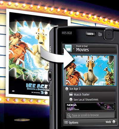
I hadn’t really looked at Nokia’s Point & Find concept before, even though it has been shown around at least since Ubicomp 2007 and the public beta has been running since May09. After last night’s Nokia AR talk I thought I would have a peek.

point-find

OK, it’s a beta with limited functionality, and undoubtedly there are plenty of enhancements to the system and the business plan going on behind closed doors, so take this with a large scoop of salt because I only know what’s been said in public. But if I was advising Nokia on Point & Find, I would start with this:

1. The business opportunity is in the service for building and managing the image database, and managing all of the associated meta-behaviors like hyperlinking, bookmarking, purchasing, search, customer intent discovery, collaborative recommendations and so on. By building this physical-to-digital gateway between individual users and companies and institutions, Nokia can accelerate the development of the connected world platform and profit nicely from it as well.

2. The business opportunity for this is NOT in the handset. That should actually be great news for Nokia, because their core hardware business is highly commoditized and that’s a cold reality their employees have to live every day. In the long run, selling commodity hardware is not going to be the best strategy for Nokia (yes, that includes stuff like windows-based netbooks).

3. Point & Find should go on the iPhone and Android platforms, as soon as possible. Because the opportunity is in growing profitable services, not in fighting the low margin handset wars. Because the current AR hype is a swell marketing tool, and right now mobile AR is all about iPhones and gPhones. Because if Nokia doesn’t own image-based physical hyperlinking on those phones, someone else will, and that means the strategic momentum will shift. I realize this is totally countercultural, maybe even unthinkable, but that’s why it would be such an interesting play.

4. Nokia should open up an API to its backend service, so that any developer can make services that tap into that (hypothetical?) database of millions of images of products, printed ads, books, artworks and on and on. Developer momentum advances the entire market, and solidifes the platform’s competitive position. This can be one of those big web squared opportunities, if played right.

How about you, have you tried Point & Find? If you were Nokia, what would you do?

Nokia’s approach to mobile augmented reality

Tuesday, August 25th, 2009

We had good AR-related fun at last night’s talk by Kari Pulli and Radek Grzeszczuk from Nokia Research, “Nokia Augmented Reality” hosted by SDForum. It was basically a survey of AR-related work done at Nokia in the last few years, with special emphasis on their research work in image-based recognition.

Kari presented an overview of several research projects, including:

MARA (Mobile Augmented Reality Applications) — A GPS+compass style AR prototype, also using accelerometers as part of the user interaction model. See also this Technology Review article from Nov06.

Image Space — “A user-created mirror world”, or less romantically, a social photo capture & sharing system, using GPS+compass to locate and orient photos you take and upload, and allowing you to browse others’ photos taken nearby.

Landmark-Based Pedestrian Navigation from Collections of Geotagged Photos — A bit hard to describe, best to have a scan of the research paper (pdf).

Point & Find — Mobile service that uses image-based recognition to tag and identify physical objects such as products, movie posters and buildings and provide links to relevant content and services. This is being incubated as a commercial service and is currently in public beta.

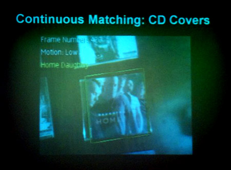
nokia-ar

Radek did a technical dive into their approach to image-based recognition, touching on a variety of image processing techniques and algorithms for efficiently extracting the salient geometric features from a photograph, and identifying exact matching images from a database of millions of images. The algorithms were sufficiently lightweight to run well on a smartphone-class processor, although matching against large image collections obviously requires a client-server partitioning. This work seems to be an important part of NRC’s approach to mobile AR, and Radek noted that their current research includes extending the approach to 3D geometry as well as extracting features from streaming images. Capturing a comprehensive database of images of items and structures in the world is one barrier they face, and they are considering ways to use existing collections like Google’s Street View as well as urban 3D geometry datasets such as being created by Earthmine. Another area for further work is matching images that do not contain strong, consistent geometric features; the algorithms described here are not useful for faces or trees, for example.

Update: DJ Cline was there and has pictures of the event, the slides and the demo.

Related links:
SDForum Virtual Worlds SIG
SDForum Emerging Technologies SIG
Gathering of the AR tribes: ISMAR09 in Orlando

a few remarks about augmented reality and layar

Wednesday, June 24th, 2009

I genuinely enjoyed the demo videos from last week’s launch of the Layar AR browser platform. The team has made a nice looking app with some interesting features, and I’m excited about the prospects of an iPhone 3GS version and of course some local Silicon Valley layarage.

At a technical level, I was reminded of my Cooltown colleagues’ Websign project, which had the very similar core functionality of a mobile device with integrated GPS and magnetometer, plus a set of web services and a markup language for binding web resources (URLs) to locations with control parameters (see also: Websigns: Hyperlinking Physical Locations to the Web in IEEE Computer, August 2001). It was a sweet prototype system, but it never made it out of the lab because there was no practical device with a digital compass until the G1 arrived. Now that we have location and direction support in production platforms, I’m pretty sure this concept will take off. Watch out for the patents in this area though, I think there was closely related prior art that even predated our work.

Anyway I looked carefully at all the demos from Layar and the various online coverage, and wondered about a few things:

  • Layar’s graphical overlay of points of interest appears to be derived entirely from the user’s location and the direction the phone is pointed. There is no attempt to do real-time registration of the AR graphics with objects in the camera image, which is the kind of AR that currently requires markers or a super-duper 3D point cloud like Earthmine. That’s fine for many applications, and it is definitely an advantage for hyperlinks bound to locations that are out of the user’s line of sight (behind a nearby building, for example). Given this, I don’t understand why Layar uses the camera at all. The interaction model seems wrong; rather than using Layar as a viewfinder held vertically in my line of sight, I want to use it like a compass — horizontally like a map, and the phone pointed axially toward my direction of interest. This is most obvious in the Engadget video, where they are sitting in a room and the links from across town are overlaid on images of the bookshelves ;-) Also, it seems a bit unwieldy and socially awkward to be walking down the street holding the phone in front of you. Just my $0.02 there.
  • How will Layar handle the navigation problem of large numbers of active items? The concept of separate “layars” obviously helps, but in a densely augmented location you might have hundreds or even thousands of different layers. Yes this is a hard UI/UX problem, but I guess it’s a problem we would love to have, too much geowebby goodness to sort through. I suppose it will require some nicely intuitive search/filtering capability in the browser, maybe with hints from your personal history and intent profile.
  • Will Layar enable participatory geoweb media creation? I’d be surprised if they don’t plan to do this, and I hope it comes quickly. There will be plenty of official corporate and institutional voices in the geoweb, but a vibrant and creative ecosystem will only emerge from public participation in the commons. This will demand another layer of media literacy, and this will take time and experimentation to develop. I say the sooner we get started, the better.

In any case, good luck to the Layar team!